- May 30, 2026
- by Jazeeraadv
Common Errors in Building Signage Design and Placement
Table of Contents
- Key Takeaways
- How signage mistakes affect business?
- Are you using the wrong sign size?
- Why does poor placement reduce visibility?
- Is your message too complicated?
- Does lighting affect sign performance?
- Are indoor signs creating confusion?
- Why does material choice matter?
- Quick tips to improve signage
- Wrapping up
- Frequently asked questions
Key Takeaways
- Simple signage performs better than crowded designs
- Placement affects visibility more than decoration
- Correct lighting enhances nighttime attention
- Indoor signs should guide visitors clearly
A signage board should be used to provide guidance, enhance visibility, and reinforce a brand. Many businesses make basic sign design and placement errors, however, that diminish the effect of their signage. Established companies such as Jazeera Advertising know that inadequate signage planning may result in low customer attention, confusion, and wasted investment. Knowing about these standard mistakes can, therefore, make it simpler for businesses to design more effective signage.
How signage mistakes affect business?
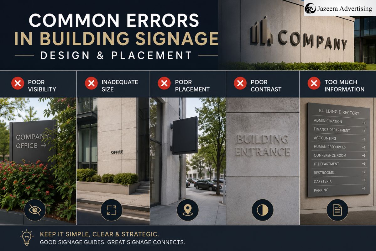
Signage is often the first thing people notice about a shop, office, hotel, or showroom. If the design is not clear or placed unwisely, customers can simply overlook it. Additionally, poor signage can reduce trust, as often signs are used to reflect the professionalism of the business.
Appearance is the only thing many property owners care about. But readability, distance, lighting, and positioning are important factors in effective signage. Jazeera Advertising has been part of numerous commercial projects where placement improvements within days resulted from the tiniest corrections.
Common issues are
- Wrong font size
- Poor lighting
- Overcrowded text
- Weak color contrast
- Incorrect installation height
- Low-quality materials
Therefore, signs should always be designed keeping in mind the movement of customers and their viewing distance.
Are you using the wrong sign size?
One of the most common errors is choosing a sign size without taking into account the viewing distance. A sign can be pretty up close and seem completely illegible from the road.
For example:
| Viewing Distance | Recommended Letter Size |
| 10 feet | 1–2 inches |
| 50 feet | 5–6 inches |
| 100 feet | 10–12 inches |
Companies tend to select impressive fonts that are too light or too fancy. While they might seem contemporary, they decrease readability. In commercial buildings, bold, simple lettering is more suitable.
A lot of professionals of the best signage company in Dubai suggest testing the design digitally before the creation of it. This enables companies to see how the sign will look at various angles and distances.
Furthermore, it enhances clarity and customer interest by leaving space between each letter.
Why does poor placement reduce visibility?
However, no matter how well designed a sign is, if it’s installed the wrong way, it can fail. People notice and understand the message quicker when it is placed directly.
Typical placement errors are the following:
- Signing behind trees or poles
- Signs set at the wrong height or level
- Covering signs with glass reflections
- Ignoring traffic direction
- Install signs in areas of insufficient lighting.
Signs should be linked to customer flow for outdoor branding. So, the entrances, parking areas, and walls that face the road are typically the best places.
Jazeera Advertising will recommend pre-installation testing for visibility in daylight and at night before installing. This is a useful technique to prevent unnecessary repositioning later in the process.
When companies are looking for the best outdoor signage company in Dubai, they tend to pick firms that are knowledgeable about a variety of methods and not just the design software.
Is your message too complicated?
Too many details are added onto a single sign by many businesses. People typically only take 2-3 seconds to read signs, though.
A good sign needs to convey information rapidly. The message should be brief, concise, and comprehensible, therefore.
Avoid these mistakes:
- Long sentences
- Too many colors
- Multiple font styles
- Excessive graphics
- Small contact details
Rather, have a single strong message. A retail store sign should primarily display the following:
- Business name
- Main service
- Indicators that show the direction or entry point.
Besides, it makes background and text stand out against each other. Dark text on light background or white text on dark colors seems to work best.
That’s why professionals signage solutions Dubai emphasize simplicity and readability while creating a signage solution.
Does lighting affect sign performance?
Yes, lighting is a significant part of effectiveness for signage. Numerous companies put up quality signs without considering how they look at night.
There are a number of issues with poor lighting:
- After dark, the site is not visible to customers.
- Your text is hard to read.
- Colors appear faded.
- Brand visibility decreases.
LED lighting is now widely used, as it enhances the visibility and also lowers energy expense. But being too bright can be distracting to viewers as well.
So, it is necessary to have balanced illumination. The business is dependent on the use of front-lit, halo-lit letters and backlit acrylic boards.
It is good practice to view the signs at various angles before they are approved, Jazeera Advertising says. This is for providing comfortable visibility without glare.
Are indoor signs creating confusion?
But indoor signage is also crucial, as it helps to direct people into a building. The poor quality of the indoor signs can cause frustration, particularly in malls, offices, hospitals, and hotels.
The most common mistakes in using signs indoors are:
- Missing directional arrows
- Inconsistent colors
- Poor placement near elevators
- Small room numbering
- Lack of floor guidance
Straightforward navigation enhances customer satisfaction and time-saving. So, it is always essential that the style of any signage used in the interior of the building matches.
An experienced indoor signage company in Dubai will study the circulation before they make directional systems. This means people can easily move around without having to get help over and over.
Additionally, if symbols are used in conjunction with text, this helps to understand the text for the international visitors.
Why does material choice matter?
However, many companies choose signage material based on how much they can afford. But weather, exposure to sunlight, and maintenance are important too.
The poor-quality materials can lead to the following:
- Color fading
- Rust formation
- Cracks and peeling
- Water damage
- Weak structural support
Signs outdoors will need materials that are sturdier, such as aluminum, acrylic, stainless steel, or weather-resistant vinyl.
While these may be less expensive upfront, they can prove to be more expensive to repair in the future. So, if you invest in durable materials, you are likely to get the most value.
Quick tips to improve signage
Companies should perform pre-installation checks such as the following:
- Will the sign be visible from a distance?
- Is the message brief and to the point?
- Is the light functional at nighttime?
- Are there things blocking the sign?
- Is there any difficulty in reading colors?
- Is the sign in keeping with the brand image?
Small improvements in these areas can significantly improve customer attention.
Wrapping up
It’s not all about signage design. It’s also about visibility, clarity, placement, and customer experience. Businesses that do not make common, obvious mistakes will be more likely to grab people’s attention and generate brand trust.
Therefore, working with professionals like Jazeera Advertising can help companies create effective and durable signage systems. Businesses today opt for the best signage company in Dubai’s expert services to enable effective branding and customer navigation.
Frequently asked questions
Using too much text makes signs difficult to read quickly.
The wrong placement will lose a significant amount of visibility and customer attention.
Balance LED lighting is suitable for most signages in commercial spaces.

Construction Safety Signage Checklist Before Project Handover

Best Materials for Reception Letter Signage: Acrylic, Stainless Steel or Brass?