- October 17, 2026
- by Jazeeraadv
How Thick Should 3D Reception Letters Be for Maximum Visibility?
Table of Contents
- Key takeaways
- Why does letter thickness affect visibility?
- How do letter height and viewing distance connect?
- How do you choose the right depth step by step?
- How do materials change the right thickness?
- How does Dubai’s climate affect reception lettering?
- What mistakes should you avoid?
- How do you choose a reliable provider?
- Closing line
- Frequently asked questions
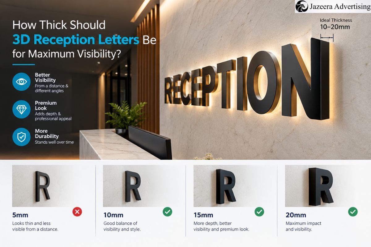
For the majority of reception wall signs, a thickness of 1 to 2 inches is appropriate for letters whose height is 12 to 24 inches. However, for letters of more considerable size, you might need a thickness ranging from 2 to 3 inches, and for small plaques, any thickness less than half an inch should be sufficient. It will be useful to get expert advice from your fabricator while calculating the thickness.
Key takeaways
- Almost all reception letters are between 1 and 2 inches deep, with the size of the letter determining the final choice.
- Calculate the height of the letter with the distance that it can be viewed from, where 1 inch per 10 feet is the basic rule.
- The substance and conditions of the wall, as well as the sun and heat in Dubai, can greatly change the ideal depth.
- Make sure that you approve the mock-up or sample before moving to production.
Why does letter thickness affect visibility?
Thickness is more than aesthetics. With a thicker letter, the wall has a clear side face, known as the depth return, that can be easily read. The light does the rest of the work. When light contacts a thick character, the side wall creates a shadow line that separates the letter from the wall.
Thickness directly affects 3 aspects:
- Clarity of edges: The deeper the depth return, the sharper the letter shapes appear from a side view.
- Shadow intensity: The sharper the shadow from the letter, the better the letter readability in both day and evening light.
- Quality perception of the letters: A thick letter signifies a serious organization.
However, remember that more is not always better. Very thick letters placed on light backgrounds may appear too heavy and require more reliable fixing mechanisms and cost more. The main idea is finding the right balance that allows enough thickness to be noticeable yet not too dominating.
How do letter height and viewing distance connect?
When it comes to legibility, letter height is more important than letter depth, although both have to be discussed together. A common guideline in the sign manufacturing industry says that there should be at least an inch of letter height for every ten feet of distance. This is the worst-case scenario and not the target. Most receiving walls will necessitate bigger letters to achieve their presence and brand impact.
Letter depth comes after letter height because taller letters can have proportionally more depth. The following chart shows the usual combinations of height and depth used in reception applications.
| Letter Height | Typical Use | Typical 3D Depth |
| 6 inches | Desk plaques, small offices | 1/2 inch |
| 12 inches | Standard reception name | 1 inch |
| 18 inches | Feature wall, mid-sized lobby | 1 to 1.5 inches |
| 24 inches | Main lobby statement | 1.5 to 2 inches |
| 36 inches | Large atrium or long-distance wall | 2 to 3 inches |
These are guidelines, not rules. If the letter is shallow, then the dark wall may require a deeper letter to show a shadow, or the shallow letter on a bright wall may need less. Always confirm the table with the person’s standing position, such as the entrance door or the reception desk.
How do you choose the right depth step by step?
Follow this process to reduce your options before getting quotes:
- Take a measurement of the longest possible viewing distance from the entrance to the wall.
- To get the minimum height of the letter in inches, divide the distance in feet by 10.
- Select the height that you want, typically at a higher level than the minimum.
- Compare that height with the depth ranges in the table above.
- Change the wall colour and lighting, increasing depth on busy walls or in dark rooms.
- Assuming the wall can bear the load, the deeper the letter, the heavier it will be.
- Before going into production, ask for a mock-up or sample.
For example, if you’re standing 30 feet away from a table, its height would be about 3 inches for reading purposes. There is an acceptable size for this product with a height between 12 and 18 inches and a depth of about 1-1.5 inches.
How do materials change the right thickness?
Material has an impact on strength and appearance. Acrylic signage in Dubai is the most popular choice for indoor names as it has clean edges and a wide variety of colours. Metal choices are stronger and better for the more slender and crisp profiles. PVC foam is light, cheap, but not as high quality.
- Acrylic: light, smooth edges, various colors. Use UV-stabilised grades near windows.
- Aluminium: light, solid, presenting thin sections and having a perfect finish, frequently painted or brushed.
- Stainless steel: a high-quality appearance, but heavy, so must be very carefully attached to solid walls.
- Rigid PVC foam: Light and economical, uses for temporary or low cost projects, durability is less.
Moreover, heavier items require more depth of fixings and, at times, thicker parts to prevent warping. Thickness and material should be considered together, and not one at a time.
How does Dubai’s climate affect reception lettering?
When planning reception signage in Dubai, consider the extreme heat, dust, and sun. Lower-grade plastics can yellow or fade with high exposure to UV, and very thin sheets can warp more easily when temperatures rise. Soluble metals can also corrode or corrode the finishing and fixing of the coast.
In most of the projects in Dubai, the following practical options help:
- Avoid using wooden blinds on sunny walls, as they can fade and damage the wall.
- Don’t use ultra-thin wallpaper in direct afternoon sunlight.
- Identify corrosion-resistant fixings for coastal or humid areas.
- Seal the edges to prevent dust and moisture from building up behind letters.
What mistakes should you avoid?
There are some common mistakes in reception projects:
- Selecting depth first and then checking the viewing distance.
- Don’t use wall lighting, as it can over-illuminate the shadow line.
- Overloading the wall with too many letter sizes/depths.
- Not installing the load check, particularly when installing on thin plasterboard.
- Allowing the use of colours viewed on a screen rather than from a physical sample.
How do you choose a reliable provider?
When considering quotes, consider more than just the cost. If they’re knowledgeable, they will ask you about how far you need to view the wall, the type of wall, and will provide a mock-up or sample. Find someone who has experience in dimensional lettering, not just printing in general. There are a lot of businesses looking for the best signage company in Dubai, and the ideal one is typically the one that presents the logic behind any suggestions.
If you’re considering other options, Jazeera Advertising can look at your wall, viewing distance, and budget before suggesting a depth so the final letters fit the space and not a cookie-cutter.
Closing line
Thickness is determined by the combination of viewing distance, letter height, material, wall type, and climate. Begin with distance and then add depth and height. A short site review prior to production is the easiest way to ensure that the office reception signage Dubai won’t have to make any costly adjustments afterwards. Jazeera Advertising can go through the testing process and assure you that you are correct in your depth before you sign up.
Frequently asked questions
Usually a 1 inch shadow is cast for 12 inch letters. More depth might be required in taller, darker-walled lettering.
Not always. Generally, acrylic can be cut thicker for depth, and aluminium can be cut thinner to give a crisp look.
They may be carried on most walls but solid surfaces such as concrete or solid masonry are best. The plasterboard can be very thin and may require reinforcement.
Check out portfolios, see how far away the visualization will be from the person, and request a mock-up. Good providers make their suggestions clear.

Emergency Exit Signs for Warehouses and Factories

Reception Signage Design Mistakes That Hurt Brand Perception