- May 14, 2026
- by Jazeeraadv
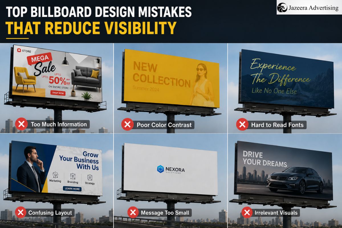
Top Billboard Design Mistakes That Reduce Visibility
Table of Contents
- Key takeaways
- Why does poor layout confuse viewers quickly?
- How wrong color choices hurt readability?
- Is font selection affecting your message?
- Does cluttered design reduce impact?
- Are you ignoring viewing distance factors?
- How does bad placement ruin even good design?
- What role does lighting and contrast play?
- Bottom line
- Frequently asked questions
Key Takeaways
- Keep your message simple and clear
- Use high contrasting colors
- Pick out bold and simple fonts
- Do not overcrowd the design
- Design according to how far away the viewer is from the sign
- Good design and proper positioning
The visibility of billboards decreases primarily because of bad design choices, rather than location. The confusing layout, low contrast, excessive text, or incorrect font can make people ignore your ad in a few seconds. Clarity is the most important thing since the viewers have only 3-5 seconds. As such, smart design is more significant than simply investing money on space.
Overloading of information is one of the problems that are observed in real campaigns that are managed by Jazeera Advertising. Nevertheless, plain and daring designs will always fare better. A billboard must convey a single message and not several ideas.
Most businesses invest in branding and signage firms in Dubai yet fail to do so because they are more creative than clear. The result? A gorgeous design that no one knows when driving.
Why does poor layout confuse viewers quickly?
The unbalanced or messy layout makes it difficult to get people to comprehend the message fast. When the elements are randomly placed, the eyes are not aware of where to look.
The most frequent layout errors are:
- There is no definite focal point.
- Text placed too close together
- Important message not highlighted
- No visual hierarchy
For example, when you have all your logo, headline, and contact details the same size, the viewer becomes confused. Thus, you have to lead the eyes of the viewer step by step.
The professional teams such as Jazeera Advertising have a simple rule to follow: first headline, then visual, then brand name. This flow enhances readability in real time.
Even the best signage company in Dubai cannot correct bad layout when the idea itself is not laid out. An organized and neat design will always work better than a cluttered one.
How wrong color choices hurt readability?
Color is a significant factor in visibility. Nevertheless, most companies use colors depending on brand preference rather than legibility.
The following are typical color errors:
- Low contrast (light text on light background)
- Excessive use of colors in a single design.
- Neon or too bright colors that put a strain on the eyes.
- Background overpowering the text
As an example, yellow text on a white background can appear fashionable but is nearly impossible to read at a distance. Thus, the best combinations are high contrast, such as black-white or yellow-black.
Firms that provide signage solutions Dubai will usually propose tried color combinations that will perform in the outdoor environment. In addition, the lighting conditions also influence the appearance of the colors in day and night.
An effective billboard must be seen in the sun, in the shade, and even in the low light. Therefore, the choice of color should be not only creative but also practical.
Is font selection affecting your message?
Yes, the font selection directly influences the readability. Most billboards fail merely because the text is not readable within a short period of time.
Common font mistakes:
- Using fancy or script fonts
- Excess fonts in a single design.
- Small font size
- Light lettering that fades away at a distance.
A billboard is not a website. However, plain and bold fonts are the most effective. The reason why the use of sans-serif fonts is normally preferred is the fact that the fonts are easy to read even when one is at a distance.
When dealing with projects in Jazeera Advertising, fonts are tried at various distances before finalizing. This makes the message remain clear even when at high speed.
Although you may engage the best outdoor signage company in Dubai, effective use will still be diminished by using complex fonts. So, style must always precede clarity.
Does cluttered design reduce impact?
Yes, one of the largest errors in billboard design is clutter. When you attempt to add too much information, nothing really comes out.
Typical clutter issues:
- Too many words
- Multiple offers in one billboard
- Excessive number of pictures or graphics.
- Extraneous information such as addresses or prolixity.
Ideally, a billboard should include:
- One headline
- One visual
- One brand message
That’s it.
For example, rather than compose a complete paragraph, compose a short and strong line. In addition, the white space (empty space) is also crucial. It assists in making the main message stand out.
The error that many businesses that use billboards & flex printing services in Dubai make is that they treat billboards as brochures. But simplicity is always triumphant in outdoor advertising.
Are you ignoring viewing distance factors?
The distance is a factor that is not given much thought, yet it has a direct affect on how your billboard will perform. Individuals tend to view billboards either at a distance or when traveling at a high speed.
The main aspects that should be taken into consideration:
- The size of the text should be big enough.
- The reading time of a message should not take more than 3 seconds.
- The design must be visible at various angles.
- Small details should be avoided that fade away at a distance.
A good rule is when you cannot read it in a short time when you are far away, it will not work.
For example, a billboard along a highway should have larger fonts than one in a low-traffic location. Hence, design must be equal to location.
Professional teams such as Jazeera Advertising will always test designs under real-life viewing conditions and not just on-screen previews.
How does bad placement ruin even good design?
Even the best design may fail when it is installed in the wrong way. Placement is a gigantic factor in visibility.
Common placement mistakes:
- Blocked vision (trees, poles, buildings)
- Incorrect height or angle.
- Lack of alignment of traffic direction.
- Overcrowded billboard areas
For example, when your billboard is located in such a way that people cannot see it clearly for at least 3 seconds, then it loses its impact.
Placement strategy must therefore be in line with the movement of the audience. Many branding and signage companies in Dubai offer placement planning along with design to solve this issue.
Additionally, the selection of the appropriate location is as significant as the design itself.
What role does lighting and contrast play?
Lighting will make sure that your billboard is seen at all times. Even the best design would be useless at night without proper lighting.
Important lighting considerations:
- Adequate front lighting to see.
- Shadows or uneven lighting should be avoided.
- Make sure that colors are consistent at night.
- Use reflective or illuminated materials where necessary.
Contrast also works with lighting. A high contrast design is one that can be seen even in the dark.
As an example, dark text on a light background will be more effective under street lights. Furthermore , lighting and contrast are to be designed in tandem.
Firms such as Jazeera Advertising tend to integrate design and lighting plans in order to enhance overall performance.
Bottom line
The visibility of billboards is more of a design clarity than a budget. It can be enhanced by avoiding such errors as clutter, poor contrast, incorrect fonts, and improper placement. Therefore, when you collaborate with specialists such as Jazeera Advertising, you can be sure that your billboard will work. The right partner who provides signage solutions in Dubai can make a great difference in terms of visibility and impact.
Frequently asked questions
1. How many words should a billboard have?
Ideal 6–8 words maximum for quick understanding within a few seconds of seeing.
2. Why do simple billboards perform better?
Simplicity of design makes understanding faster when viewers are in motion.
3. What is the best font for billboards?
Fonts that are bolder and sans-serif are ideal for easy readability at a distance.
Construction Site Safety Boards in UAE: Complete Guide & Requirements 2026

Top Reception Signage Trends for Businesses in UAE 2026